Mapping Contagion
Mapping Contagion
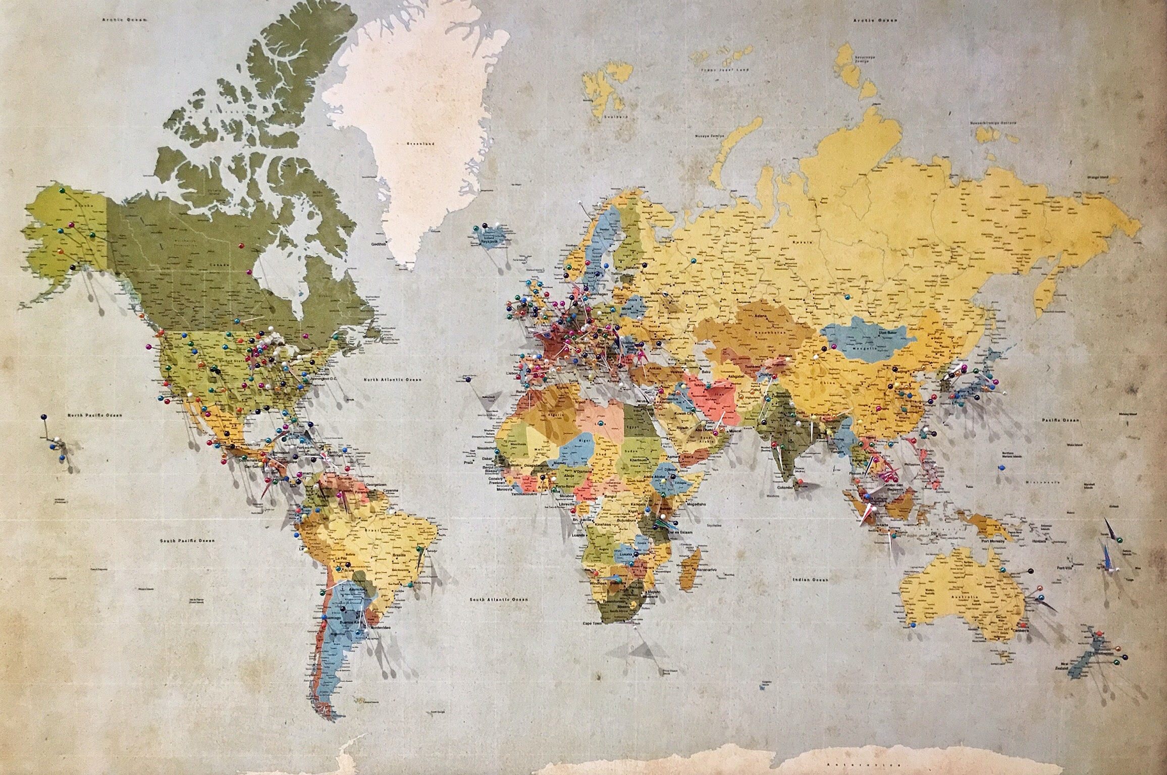
Have you noticed how maps have taken on new significance during COVID-19? Just think of how many times you’ve consulted a map to see which continents, countries, states and cities are affected by this novel coronavirus? Maybe you’ve even looked at a map of your county to check its numbers. You can easily zoom in on one on your handheld device or trace its parameters with your finger in your local newspaper. No matter how you do your map reading, the Map Geek bets that you’ve consulted more maps in recent months than you did in the period leading up to the onslaught of this outbreak. Yes, indeed– the Map Geek is not happy to see how this virus has shaken our world to its core but she is delighted that maps have become such a valuable tool in helping people to better chart and understand this disease.
Whether you’re an ordinary citizen, a nurse, an infectious disease expert, an epidemiologist or just another Map Geek, there are all kinds of COVID-19 maps out there that can serve to better inform you. Many are often accompanied by graphs and statistics much to the delight of numbers people that share a geekiness similar to the Map Geek. It’s all cool stuff despite the fact that much of the information reflects very scary and unfortunate happenings such as loss of life and economic hardship, all a result of this worldwide scourge. But still, these maps have been and will remain essential to all. The Map Geek would go so far as to say that this pandemic will forever change how people look at maps.
It should come as no surprise that these kinds of maps have been around for centuries. Of course they have! The first maps were likely carved into rock by cavemen, then they were scratched onto parchment with a plume until they finally became printed en masse for more widespread distribution. Many museums and libraries boast faded old maps from centuries ago but few possess contagion maps from the ages. Maybe it was hard hanging onto them during such troubling times. Or maybe they were destroyed for fear that they’d be transmitters of disease? (Although it’s unclear whether people back then made that connection.)
If you look on the Internet today, you can trace the spread of the Bubonic Plague, the Black Death that ravaged Europe during the fourteenth century. The majority of those maps, however, were drawn during modern times. (So if you happen to come across an old crusty map of the plague in a yard sale, know that you’ve stumbled upon quite the find.)
Many examples of disease tracking on paper do exist from the eighteenth century onward. Cholera was widely documented and most feel that this disease–and notably the study of it–gave rise to the idea of global health. The connection between international human travel and certain environmental factors revealed patterns that were in turn highlighted on maps. (Just think of the conditions that existed on those big ships that crossed the seas for the transport of goods and people back then–ugh. And once on land, the state of the ports was not much better.)
During the eighteenth century, for example, maps showed the spread of yellow fever from the Caribbean to U.S. port cities such as New York City, Philadelphia, Boston and Charleston. Thankfully today yellow fever is for the most part, only a risk in parts of Africa and South America. You can zero in exactly where in a modern map from the Centers for Disease Control and Prevention (CDC); not surprisingly, the hot spots are shaded in yellow. Fortunately there’s a vaccination for this disease that first prompted public officials to examine the connection between sanitary conditions and bad health as well as to impose quarantine from people arriving from foreign lands.
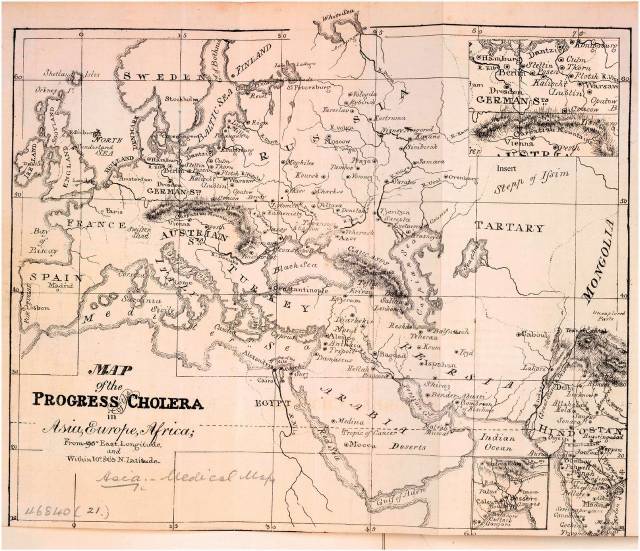
So many maps, such as the 1831 Map of the Progress of Cholera in Asia, Europe and Africa revealed a direct correlation between the trade routes (by boat, of course) and the spread of disease. Similar parallels have been found today with COVID and air travel.
Here’s a cool and widely recognized book that includes lots of contagion mapping, graphs, illustrations and pictures (all the depictions we map geeks like): The Atlas of Disease: Mapping deadly epidemics and contagion from the plague to the zika virus. The title is a real grabber, isn’t it? What the Map Geek finds especially interesting about this book is that it has four main sections that feature how these diseases are transmitted: Airborne, Waterborne, Insects & Animals, and Human-to-Human contact. Influenza, for example, falls in the Airborne category whereas ebola is Human-to-Human.
Now let’s talk about the meat of current contagion mapping. As Dr. Este Geraghty, Chief Medical Officer and Health Solutions Director at Esri, a mapping software company, emphasizes in her recent story “Mapping Epidemics: From SARS, Zika, and Ebola to the Pandemic of COVID–19,” disease surveillance is now a map-centric activity. A GIS, or Geographic Information System, is used to collect, analyze and share key data. For the past two decades leading health organizations such as the World Health Organization (WHO) and the Centers for Disease Control and Prevention (CDC) have relied on mapping and analysis to manage disease outbreaks. Hence, all the talk about flattening the curve! As Dr. Geraghty explains in this story, it’s all about real-time mapping. No wonder the Map Geek is over the moon. Now, we have full-on mapping all over the world 24/7. The age of exploration and discovery is alive and well!
As you may already know, the most talked about map in COVID-19 land is the interactive web-based COVID-19 dashboard from John Hopkins University in Baltimore. It’s the ultimate source! Created by Lauren Gardner, an associate professor, and Ensheng Dong, a first-year Ph.D student, these two brainiacs never imagined it would turn into what it has become these past months. Early on, the development of it partly stemmed from Ensheng wanting to track the novel coronavirus cases in his native China. At that time, he was plugging in the data by hand (but thankfully for him, the stats are now entered automatically). By the time this pandemic hit the U.S., the dashboard became the authoritative source for finding out the when, where and how about COVID. Well, the how is still a bit of a mystery. In any event, these two academics are rockstars to the Map Geek as well as to many other people, professionals and nonprofessionals alike.
Check it out and when you do, ponder the importance of maps for tracking disease today and over the ages. Where would we be without maps!
For more information and to take a look at some interesting old maps, check out “Cartography of Contagion” from the Library of Congress blog.
